Fine luxury needs fine tailoring, even when ground.
A hyper-premium subscription coffee brand with a deep commitment to fine detailing and authentic Milanese aesthetics.
Project Services
- Strategy
- Branding
- Packaging
- Art Direction
Suite 437
- Ingmar Swalue
- Melissa St Michael
As the hyper-premium coffee market was beginning to soar, for Calvin Smith’s new D2C subscription brand Suite 437 to stand out, it needed to get as far from the tropes of every other modern third wave roaster as possible.
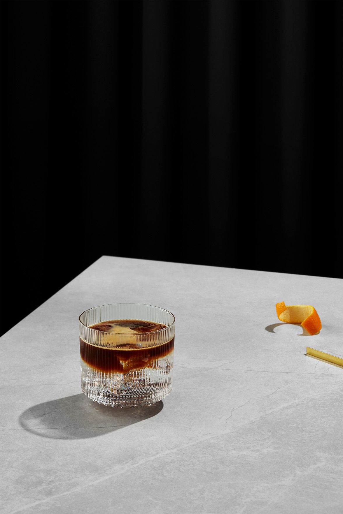
Otherness created a poetic and luxurious execution, bringing Milanese sprezzatura — the confident art of making effort seem effortless — to American kitchen counters, with packaging that felt as elegant and crafted as a fine Armani suit. No generic Instagram D2C typography here — Suite 437 would double down on a high end, glassy buildings alongside grand old palaces, limousine and Prada spin on Italian luxury.
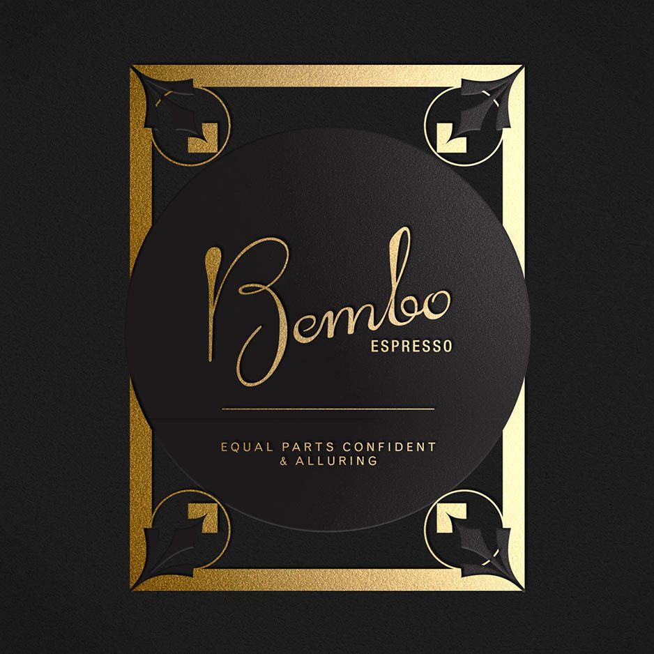
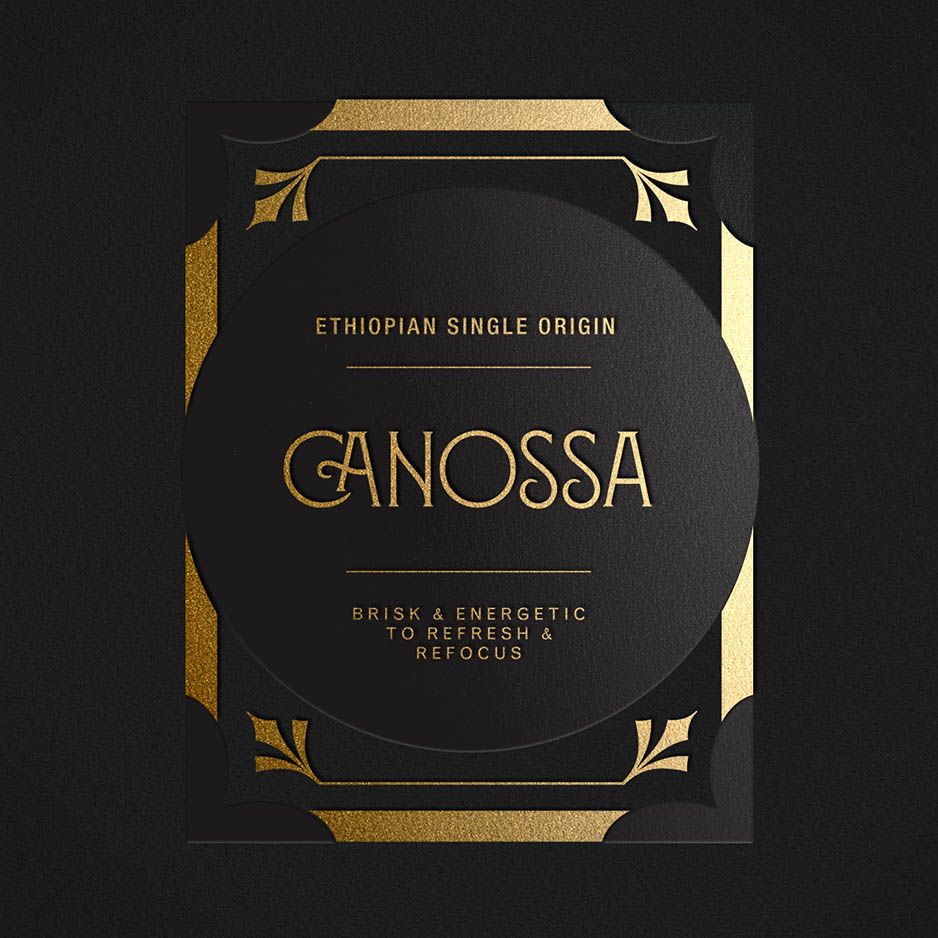
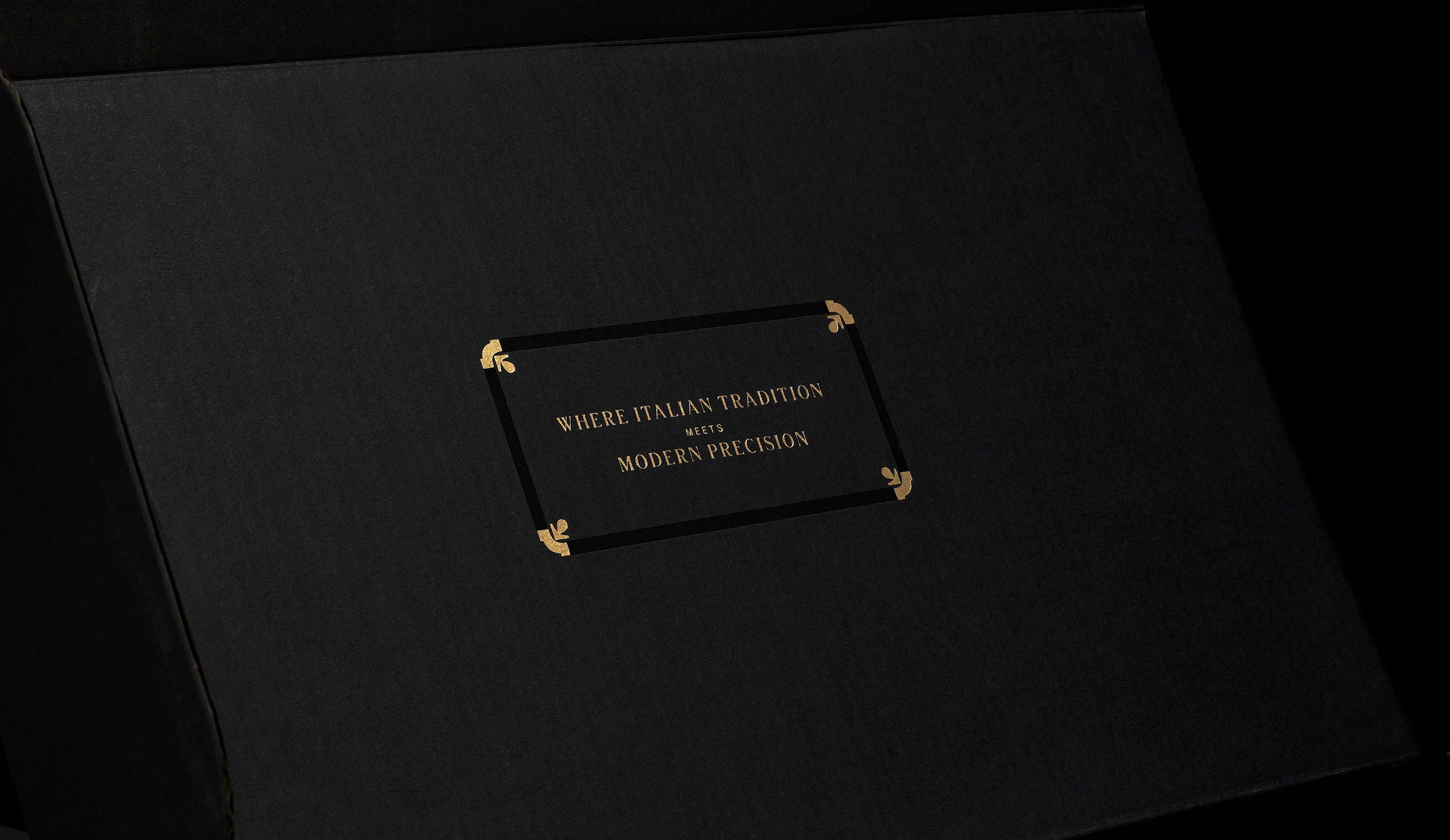
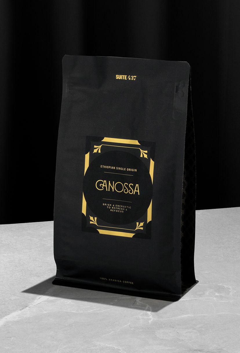
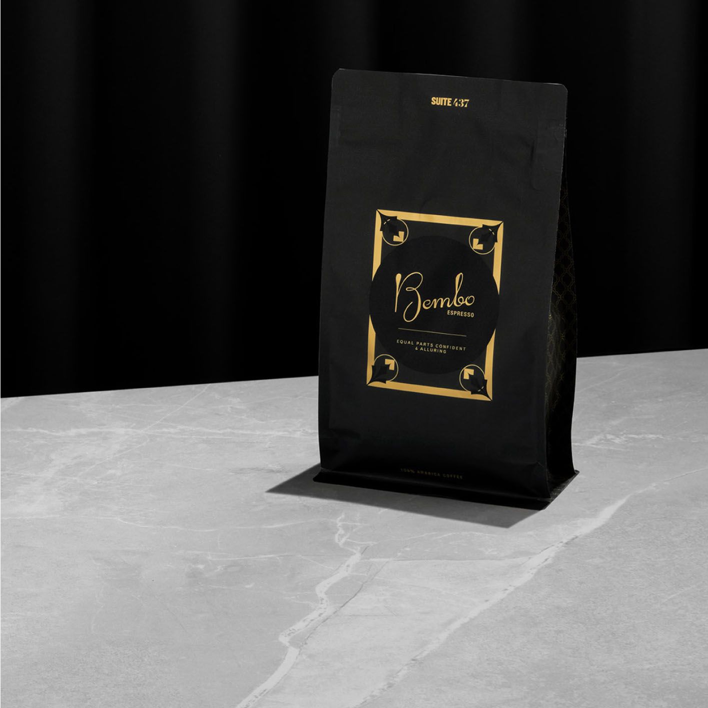
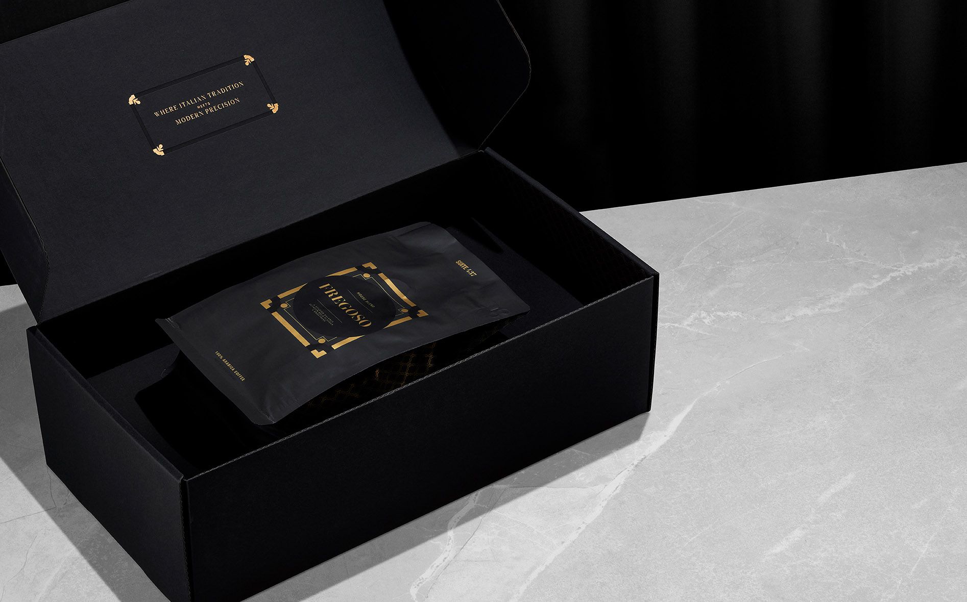
To get it right means going to the source. Joel traveled to Milan, straight into the museums (ok, with a coffee shop detour or two) to immerse himself deep in this history. Out of that, Otherness crafted an Art Deco aesthetic with matte black-on-black detailing and gold accents to frame the coffee's personalities. Your coffee, su misura.
“Throughout the process, the team at Studio Otherness exhibited patience and the willingness to see this project through to completion. The end result was a beautifully constructed e-commerce coffee business that linked unique parts of Italian heritage and contemporary branding.
I would absolutely work with Studio Otherness again. They are a tremendous value add and a big part of launching my product successfully.”
Calvin Smith, Founder
Suite 437
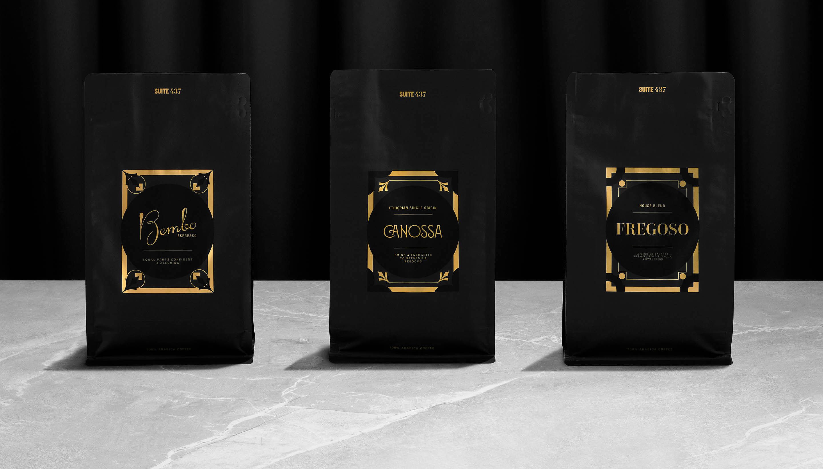
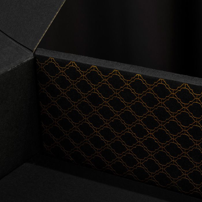
Not every gold is created equal.
Leaning into the extreme bling luxe of gold foiling and matte packaging comes with real risk. If you get it wrong on the slightest detail, it feels cheaper than if you hadn’t tried at all. That’s the difference between an Armani and a knockoff, even one using the same pattern they got from a guy who knows a guy.
Suite 437 grounds its luxury in typefaces selected with extreme care for provenance, with Italian origins and specific historical influences.
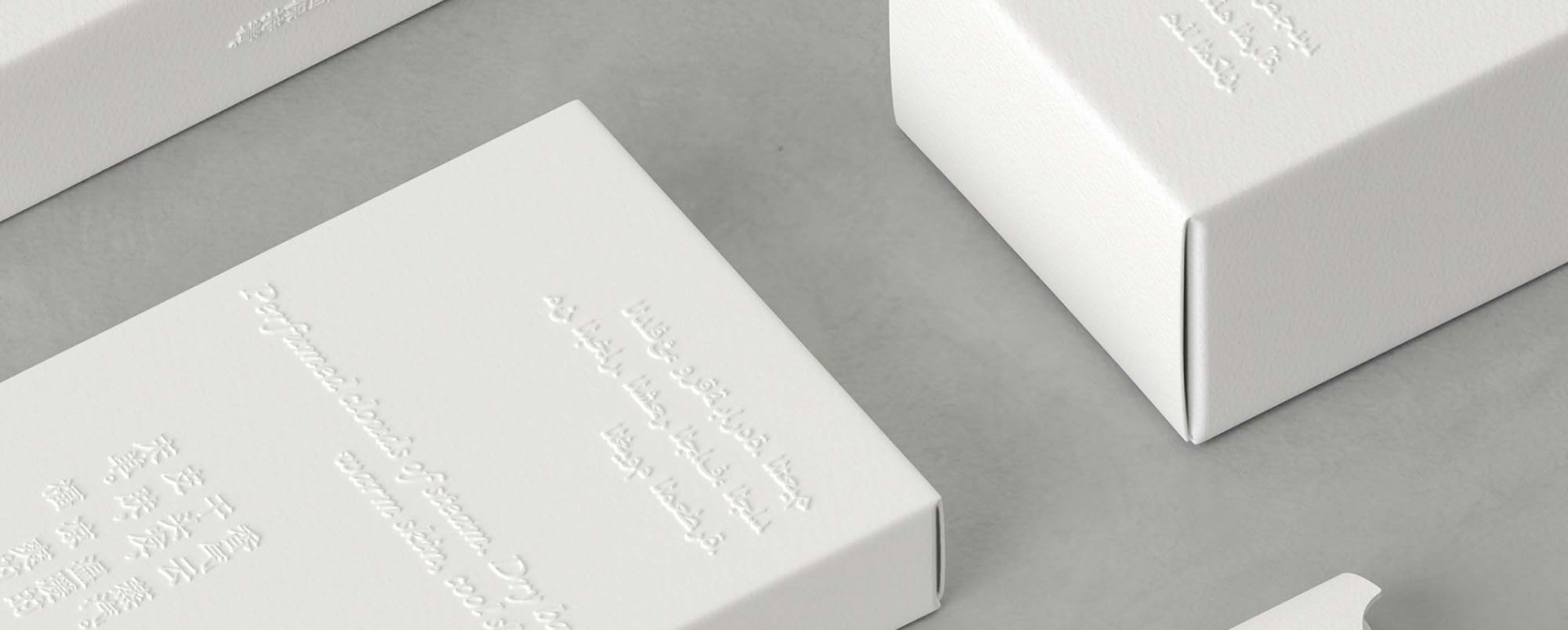
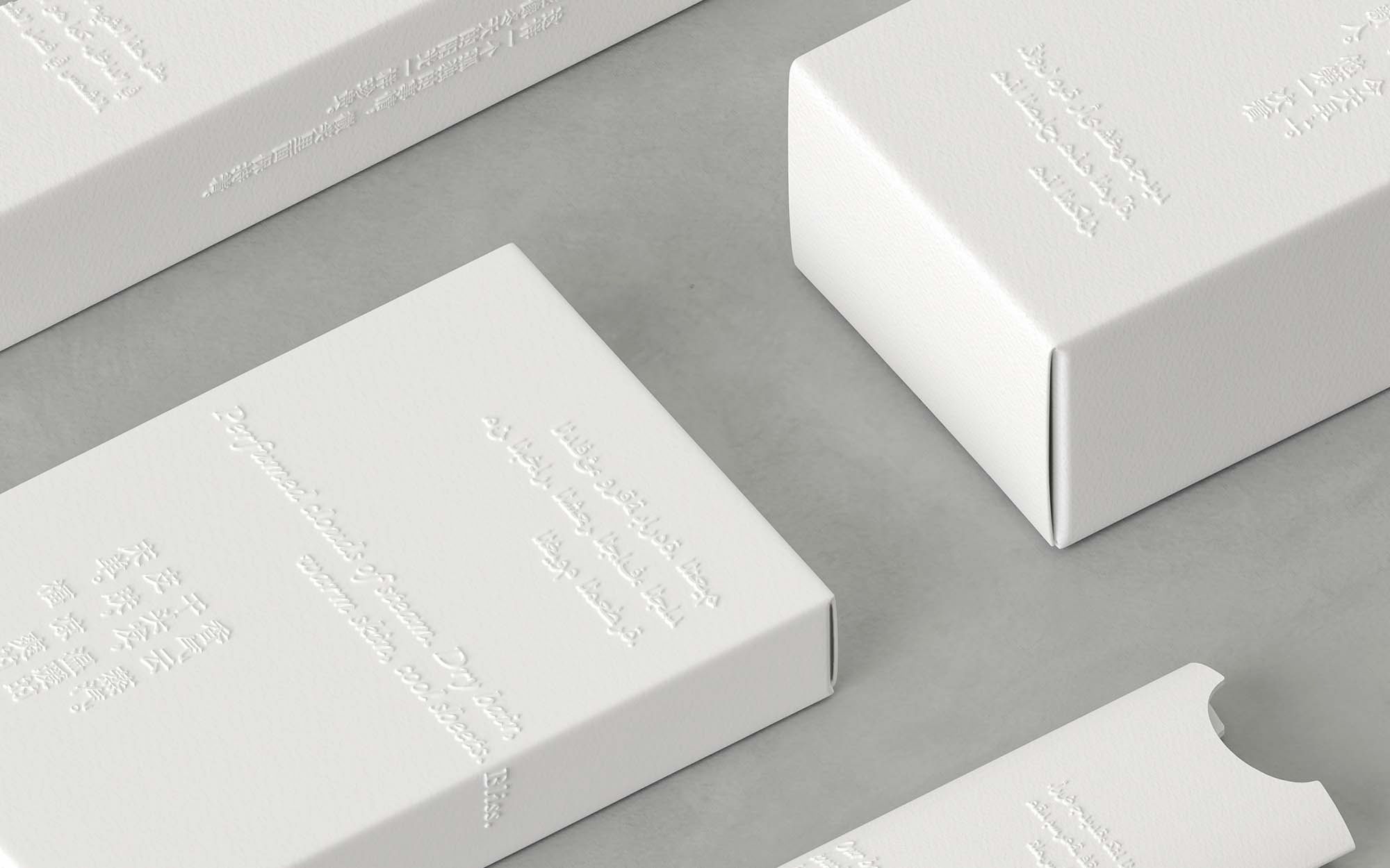
The gold used in packaging was selected through careful prototyping, worked through over multiple test runs with the China-based manufacturer. In the hands of the customer, no seams could show.
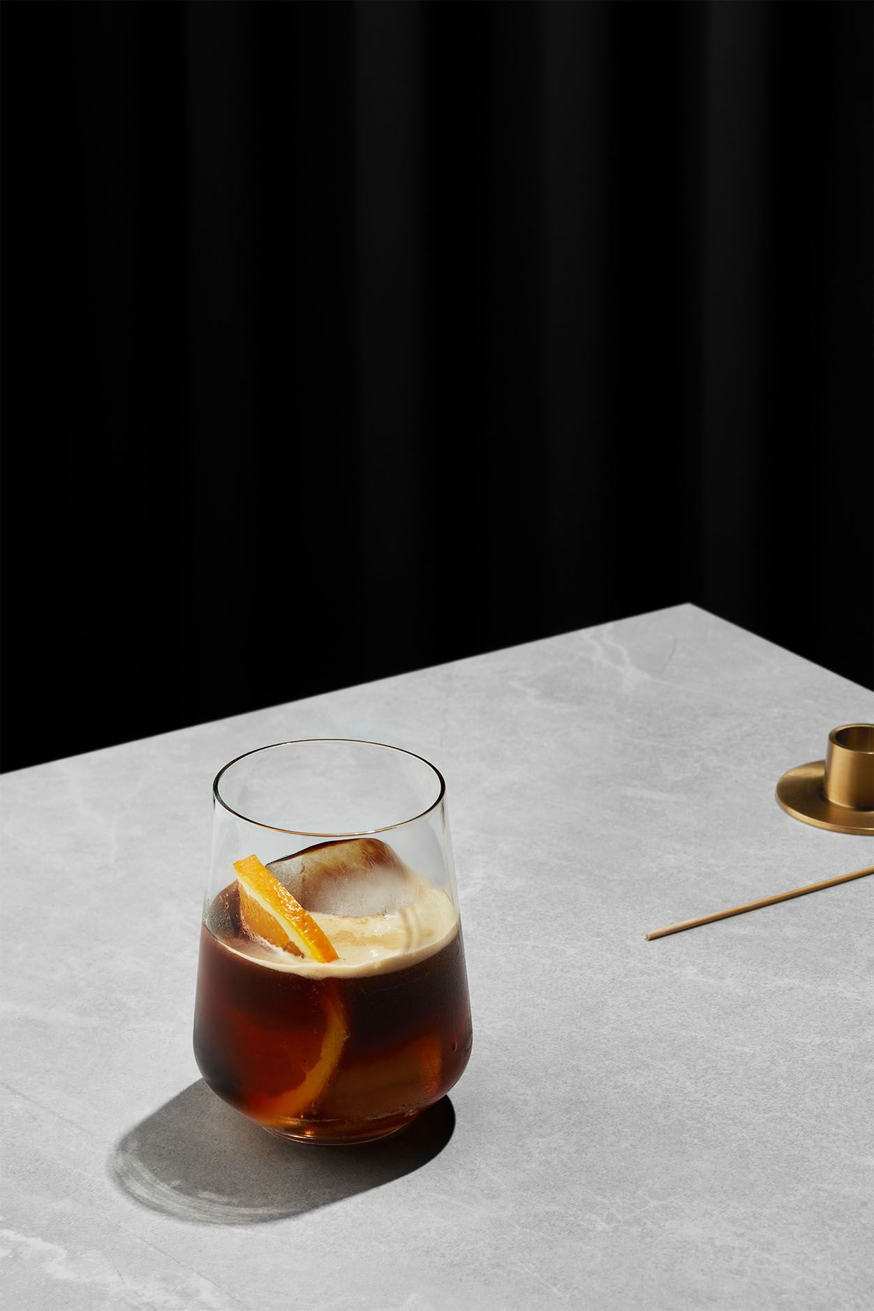
Take a sip with the courtiers
The copywriter for this project, Melissa St Michael, grounded the brand language in her Master’s degree in Medieval Studies. Her starting point for was the origin of sprezzatura ifself — Count Baldesar Castiglione’s Book of the Courtier.
The research found its way out of the packaging and into the coffee itself, with flavor profiles inspired by the personalities of courtiers that Castiglione celebrated — Fregoso, the diplomat and politician. Bembo, the historian and cardinal, and Canossa, the ultimate aristocrat.