Put a little lifestyle back into life sciences.
Embedded creative leadership for a VC-funded clinical research startup looking to build systems, teams, and creative expressions to represent it as a tech pioneer with a world-changing vision.
Project Services
- Strategy
- Branding
- Art Direction
Medable
- Aishah Mulkey
- Gabriel Lindsay
- Harris Hatzimpaloglou
- Luís Sousa Teixeira
- Michael Nelson
- Nicole Archuleta
- Nora Volger
- Raza Khan
- Rhea Handy
- Stephanie Young
- & many others
Medable — a 500+ headcount life sciences trailblazer with Series D funding — is on a mission to transform clinical research through a revolutionary patient-first research platform. Before they came to Otherness, they'd invested in several branding efforts that missed the mark — elegant graphics, sure, and design systems that might have differentiated them from others in the field, but which ultimately miscommunicated the offer and confused potential customers.
We took inspiration from standout brand refreshes in completely different but similarly stagnant spaces — such as Rimowa — along with cues from the likes of Apple and Beats by Dre.
Today, with our support, Medable stands out as elegant and user-friendly, in a space that tends to rush to overcomplicate. The in-house marketing and design teams have a modular and flexible toolkit that lets them continue to take new initiatives to market without excessive implementation burden.
Impact
$50M in bookings from enterprise clients after continued engagement across touchpoints ranging across ads, presentation decks, and experiential marketing.
“It’s really impressive — seeing something that has been missing for a while. There have been some attempts — but none of them really captured it right.”
NORA VOLGER, SVP OF MARKETING, MEDABLE
Shift the brand vibe, shift the culture.
At the outset of this ongoing project, Otherness worked with the in-house team over 6 months iterating and optimizing using fast feedback from social media to test our boundaries across every design element. Designers were challenged to break the design system to expose inefficiencies and weaknesses, then find elegant and functional solutions.
At the culmination of this process, we had thoroughly refreshed every area of Medable’s design. As much as this work prepared every designer to execute brilliantly, from creating bold statements to long-form educational content, an equally important achievement is the internal cultural shift this work has inspired. In the wake of economic shifts, we have infused a sense of pride and excitement across all Medable teams by bringing the brand to a level that’s on par with true B2C greats.
Impact
Second highest number of qualified leads amongst competitors from LinkedIn, despite the lowest net spend
3.9 million LinkedIn impressions on target accounts
#1 LinkedIn advertising engagement rate amongst all competitors
27x ROI from digital demand generation initiatives
A platform is a feeling, not a button.
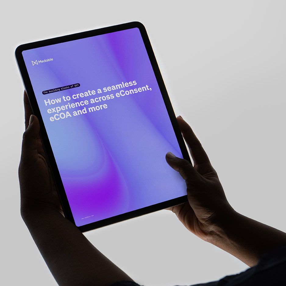
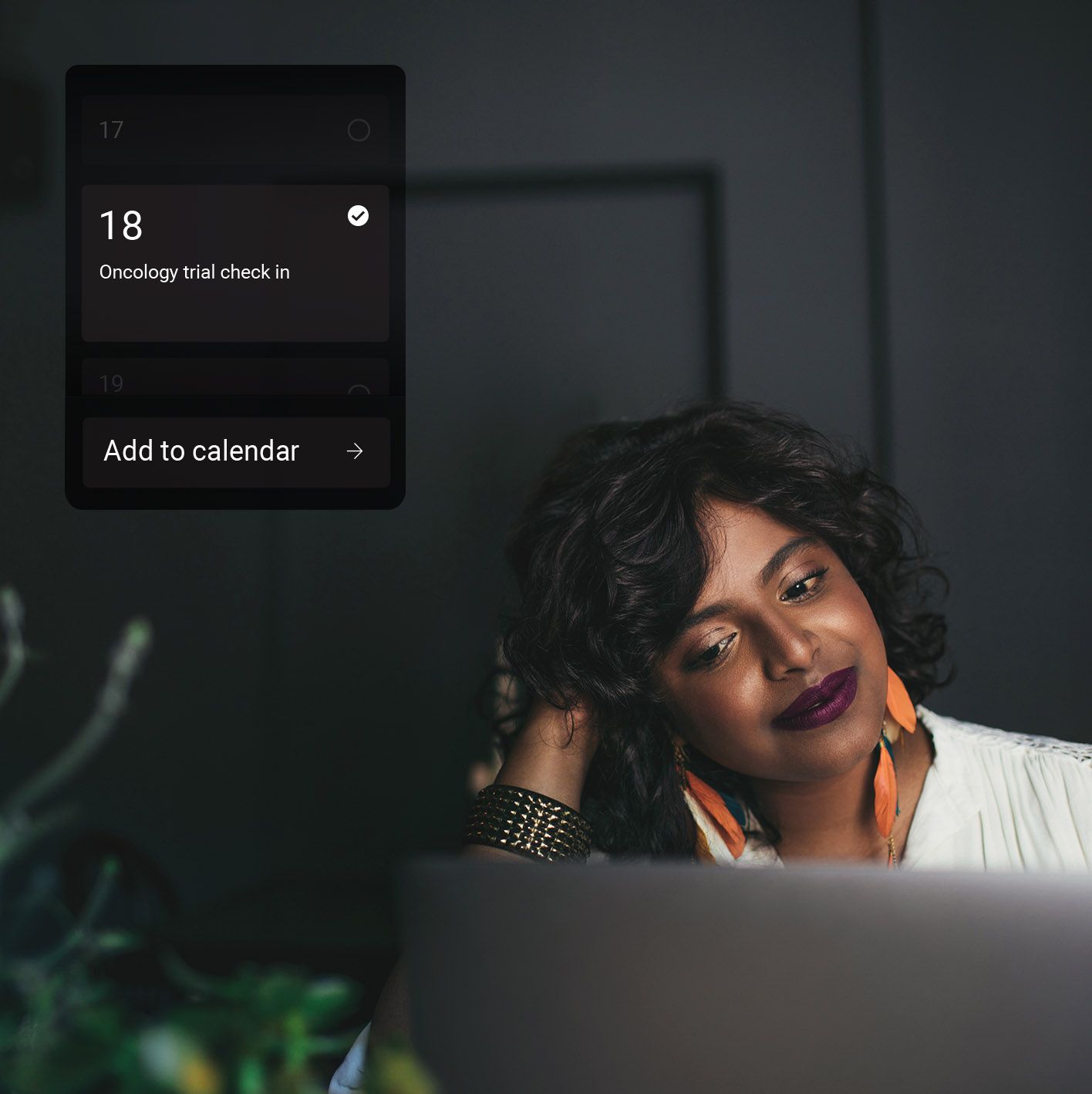
Medable's platform contains UI elements that, for confidentiality purposes, were not allowed to be shown in marketing materials. But it’s a platform experience Medable is proud of, and it was critical to somehow show off that key differentiator of their offering at every opportunity. So how do you convey the felt experience of using a product, without giving too much away?
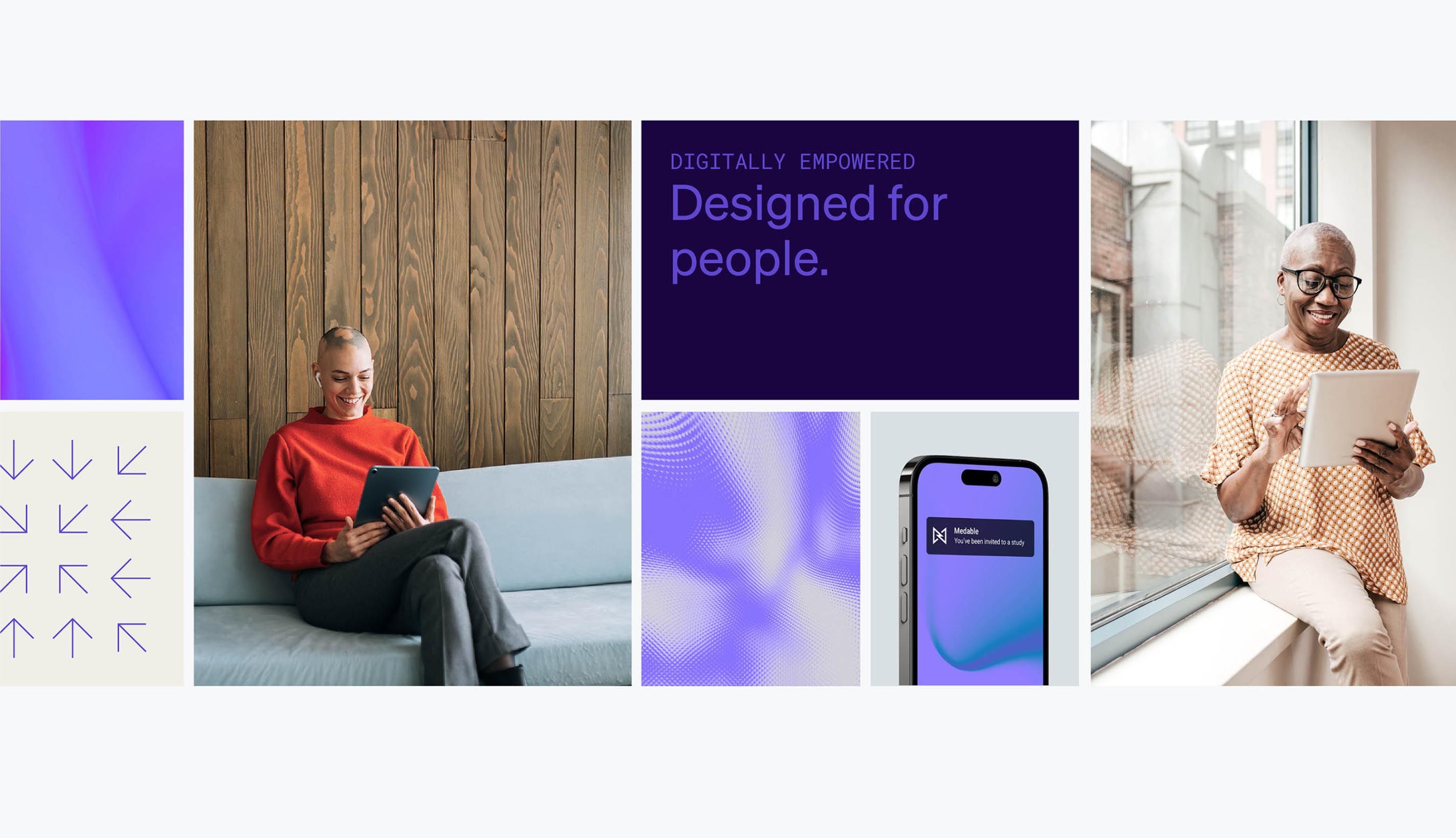
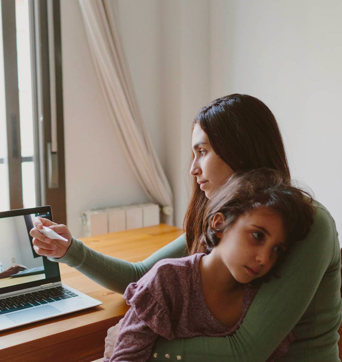
In harmony with a new photographic direction built on a delicate blend of lifestyle imagery, and depictions of researchers and remote work, Otherness introduced the use of cinematic UI notification elements as a compelling and unique overlay of product interaction. Images which are welcoming, calm, and represent the life of a research accurately, are elegantly woven with cinema-style depictions of the Medable tech easing into their day naturally, working with them seamlessly.
Imagine a clinic that isn’t cold.
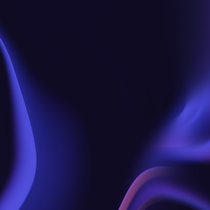
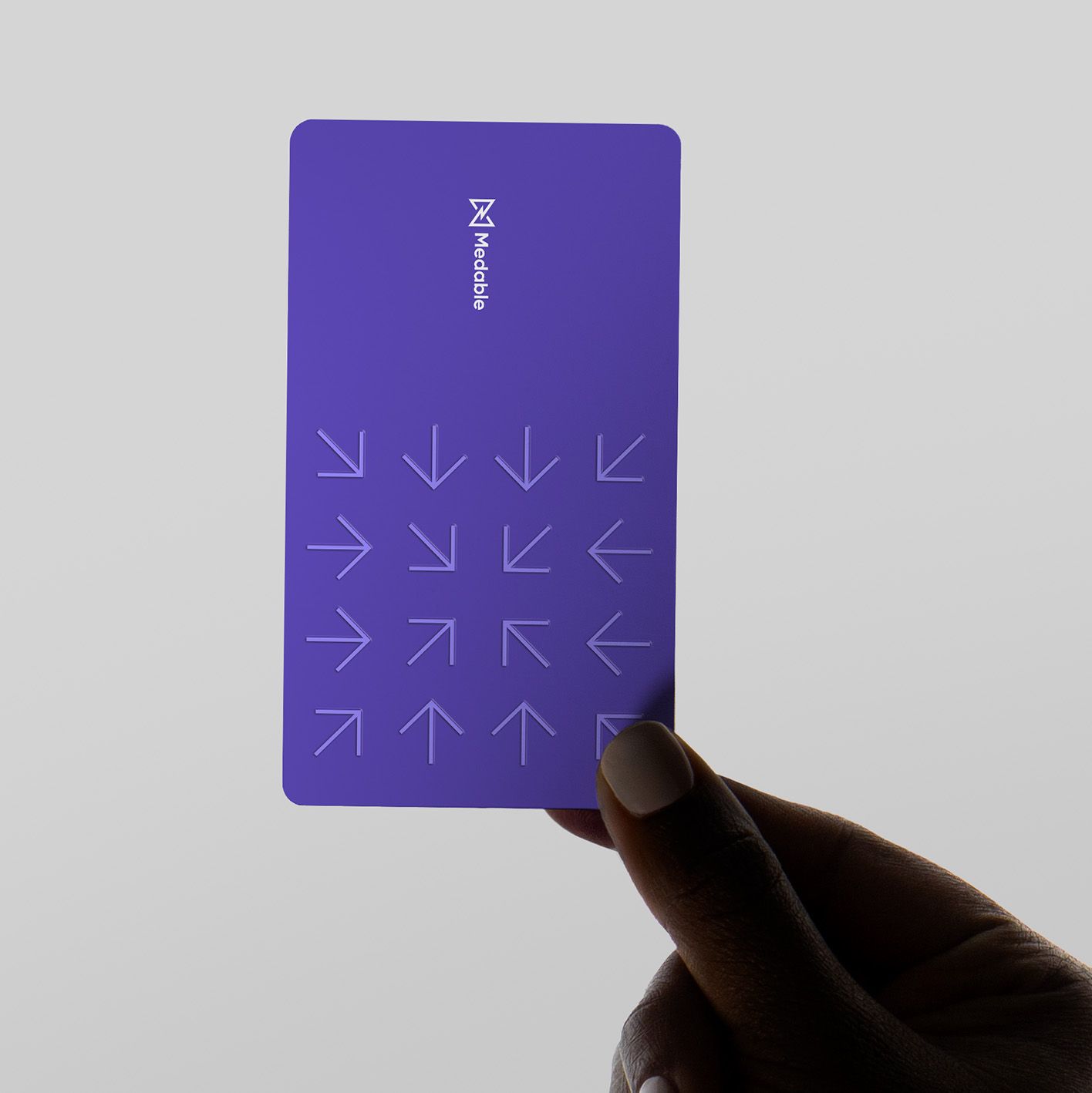
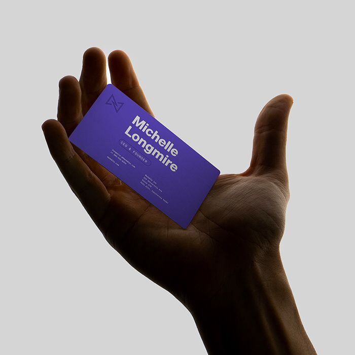
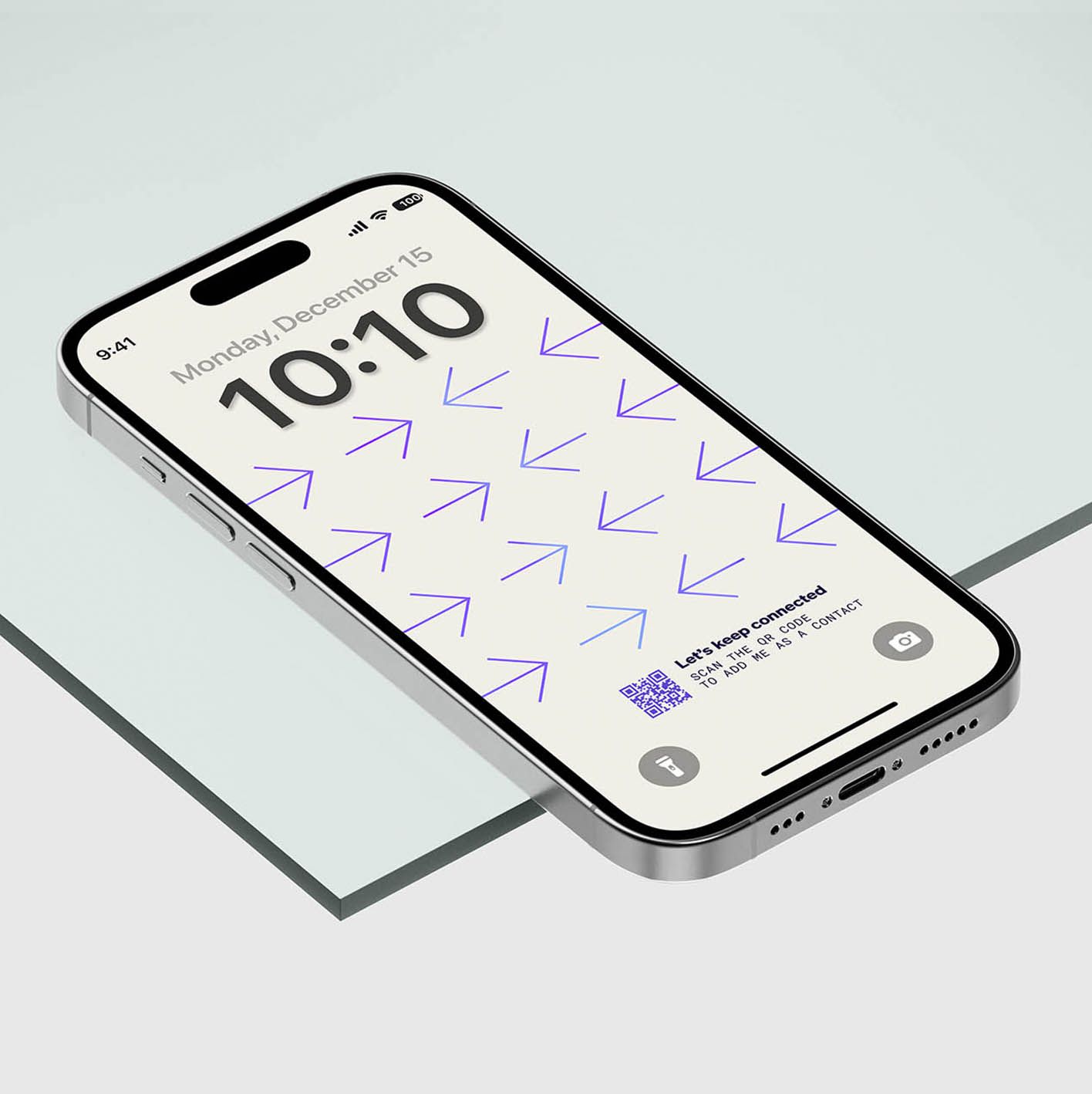
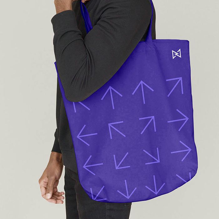
Though the underlying tech of Medable is undeniably cool, that didn’t mean the brand had to be cold. The new system includes a refreshed color palette, graphic motifs, static and motion backgrounds, motion graphics, and an updated font system. The colour scheme brought things into a refined, pioneering luxury space, using cool greys, cream, and camel tones to suggest a warm and inviting way into the world of research.
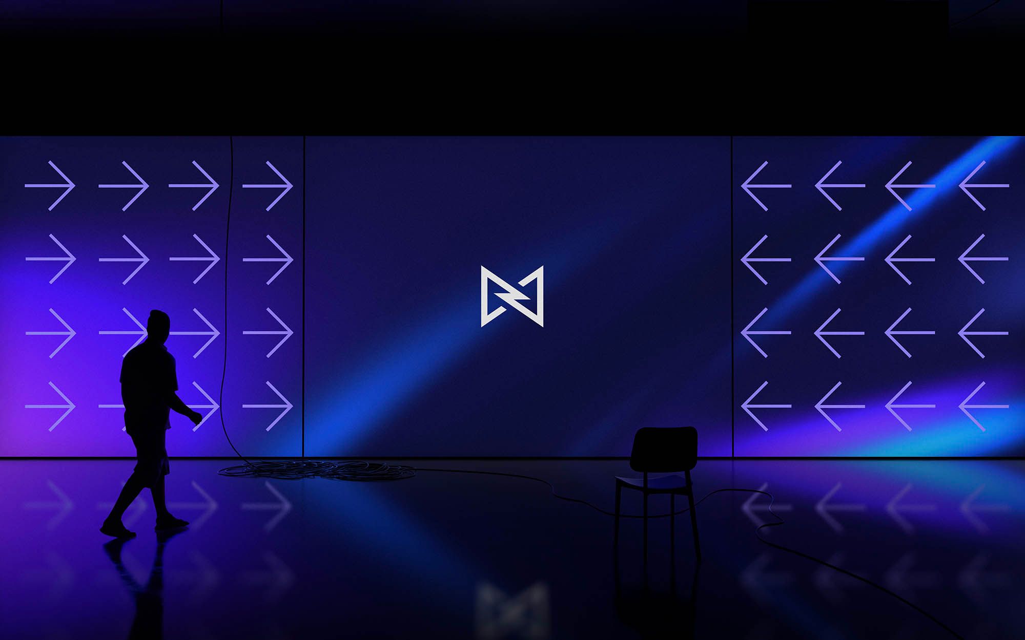
Graphic symbols that thrive in animation were used to capture complicated product concepts such as decentralization, data points, patient-centeredness, progress, and unification.
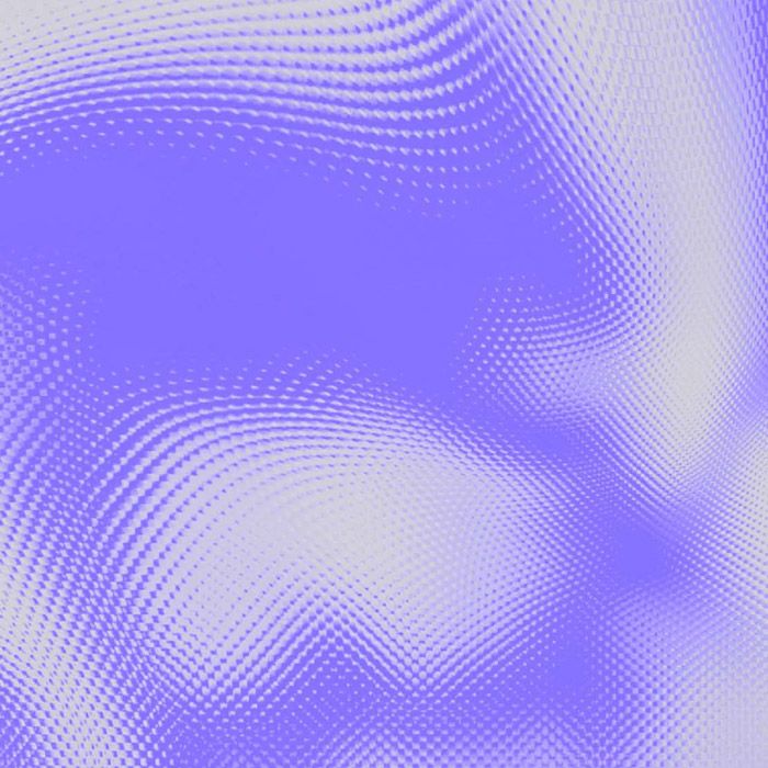
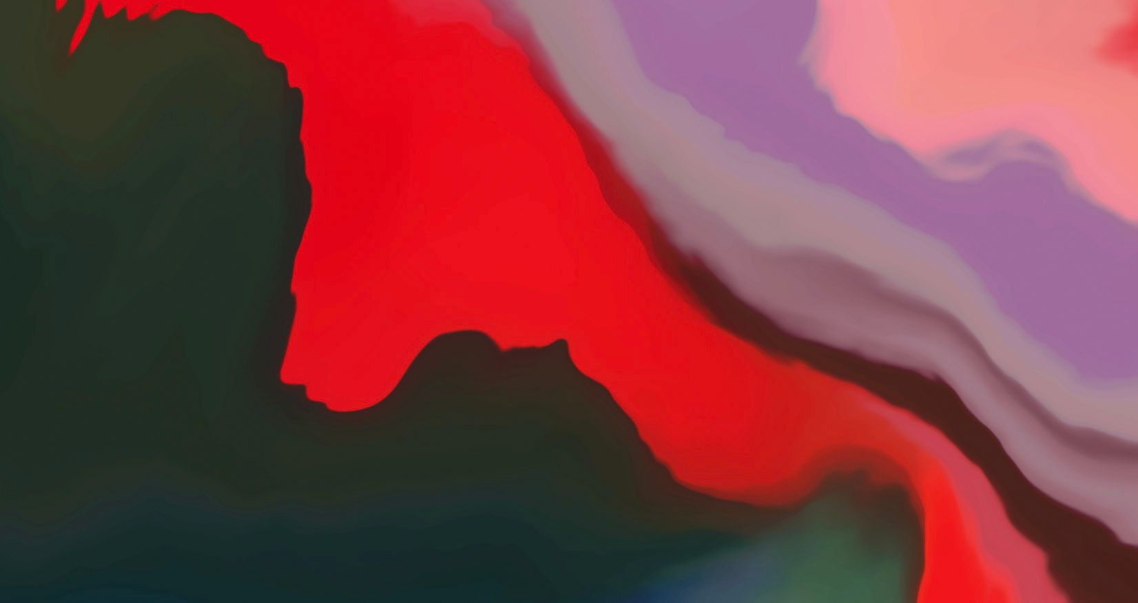
To complement this, we used abstract support imagery to bring the brand into the world of tech without disrupting that core message, drawing inspiration of fiberglass and light, rather than the previous seen-it-all-before generic labcoat stock, or closeups of moss, cell cultures, and leaves.


“Credit to Joel and the team! They’ve done in six months or so what others have struggled to do in more than a year.”
Scott molloy, head of lead generation, MEDABLE

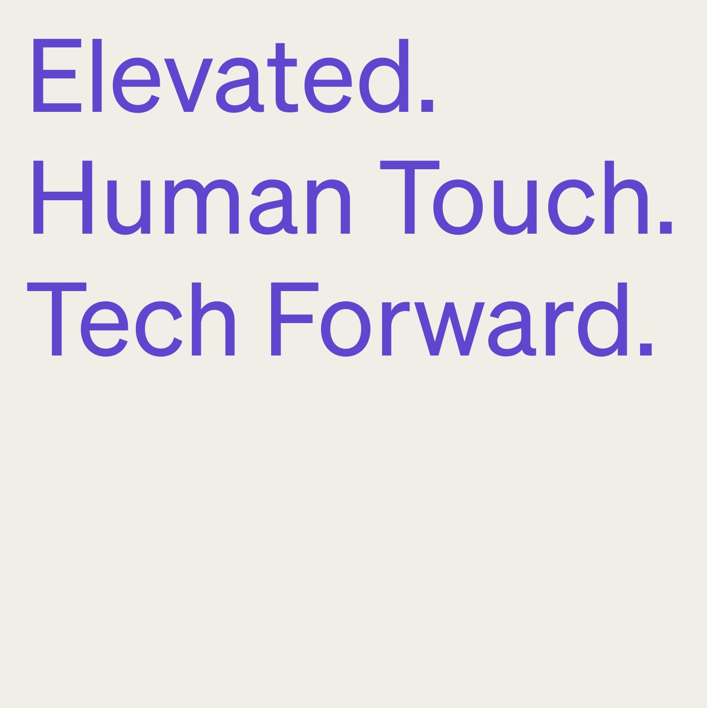
Make the complex simple, human and elegant.