Minimalism plays better with meaning.
A minimalist brand for a minimalist architect didn’t need to be minimally meaningful.
Project Services
- Strategy
- Branding
- Art Direction
Ian Bennett
- just Otherness
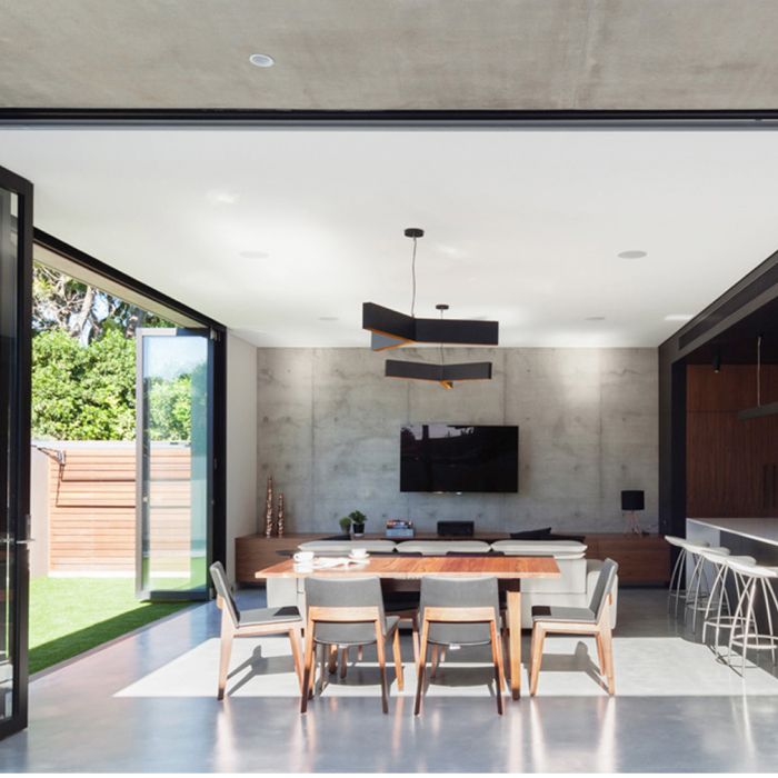
This established Australian architect came to us expressing a love for clean lines and minimal forms, but wanting a brand that went deeper than this surface level expression. Sort of like his work itself, you know? To dig deeper, we spoke to architecture professors at the School of the Art Institute of Chicago, along with other architecture bloggers and lovers, and asked them for their interpretation of Bennett’s portfolio and what they could see in it that was unique.
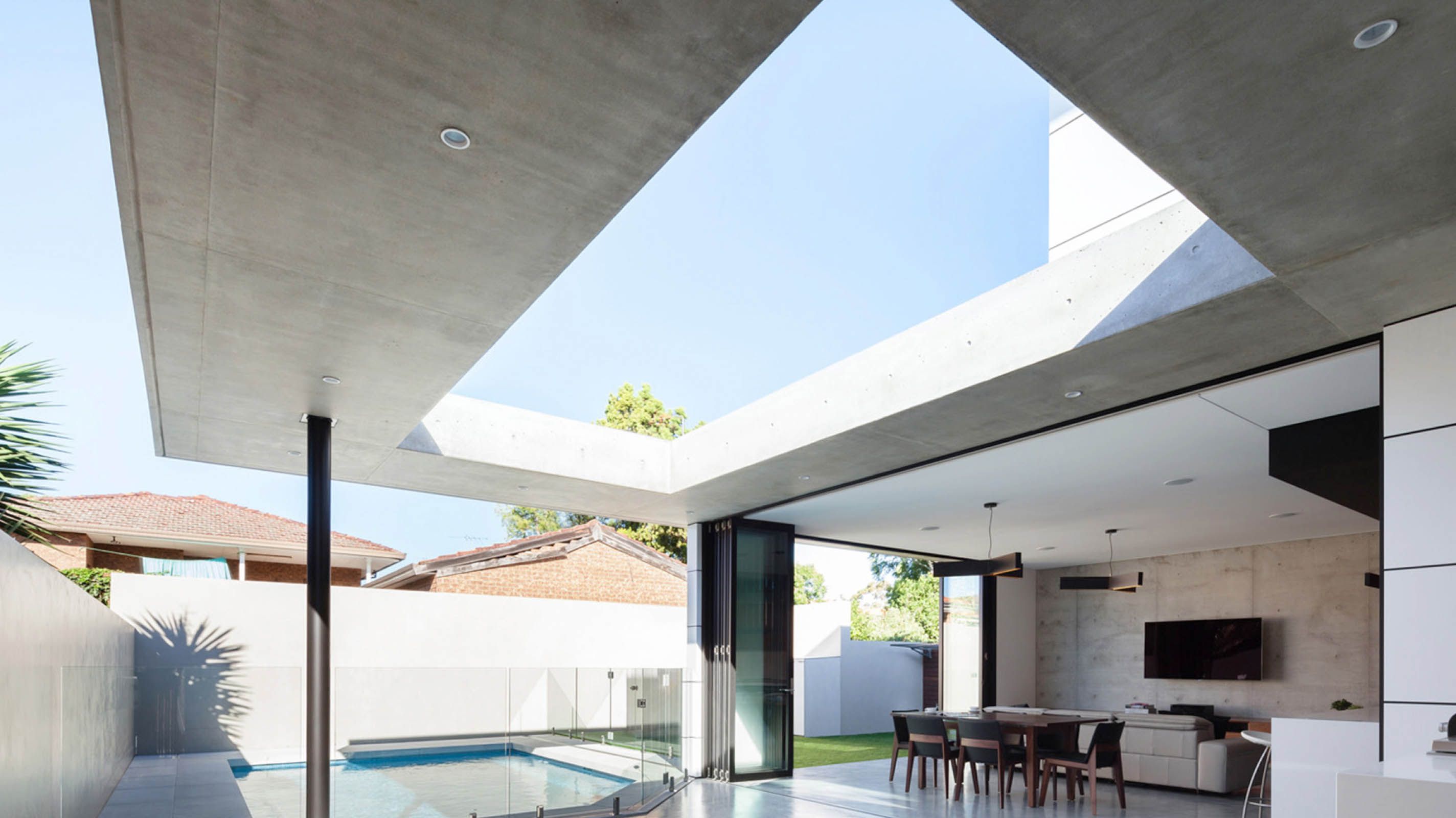
Returning to the architect, we refined this new language into a particularly Australian focus on the interplay between exteriors and interiors — an approach inspired by other warm weather practitioners such as the Brazilian modernists, but unique to its place.
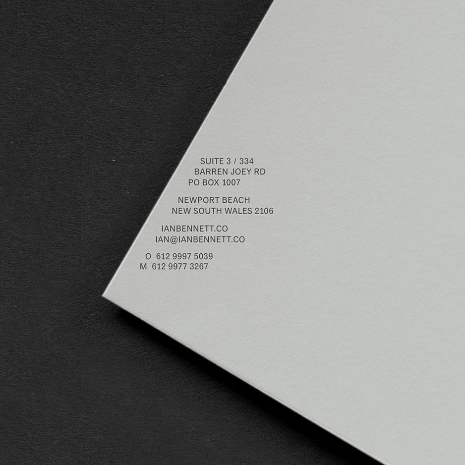
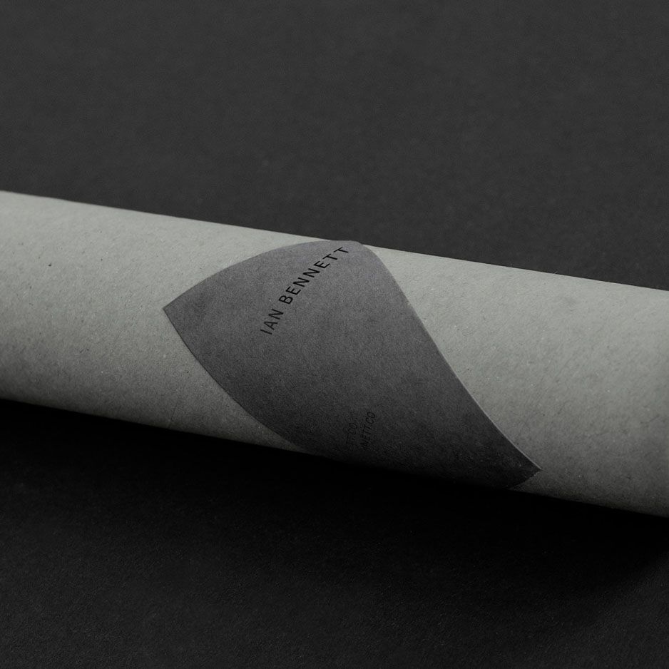
Where most of the brand concepts we create for clients focus on a multi-layered approach, this one is focused on execution of a single, specific concept that emerged from this research: a form of aesthetic play in which brand materials such as the sheet of paper in a letterhead become planar surfaces and meaning is formed in the negative spaces as much as the typography itself. Layers of grey and black provide a concrete-like foundation that feels true to Bennett’s built environments.
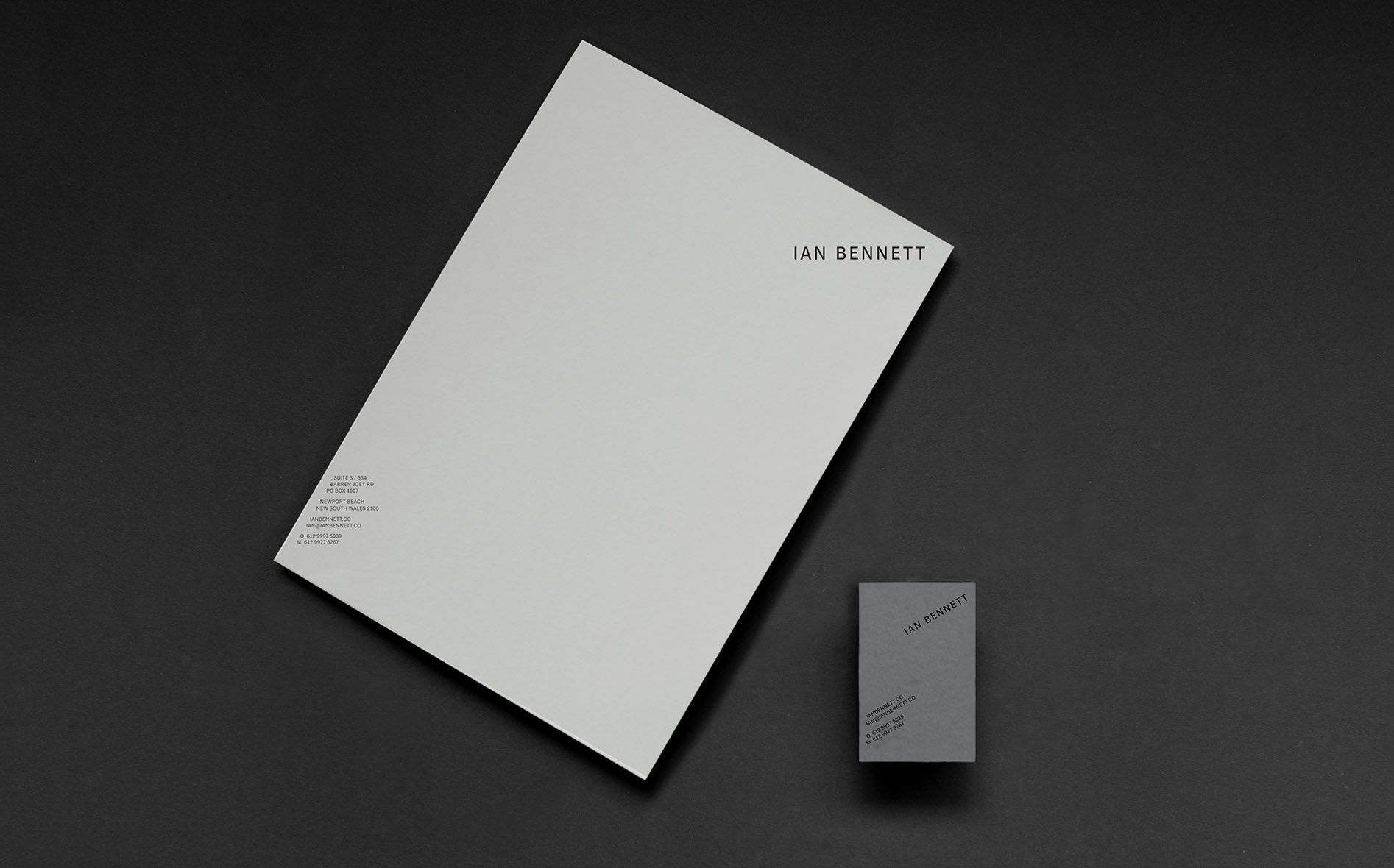
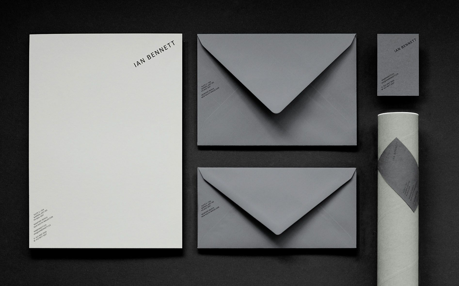
Precision type for precision plans
Otherness chose to base the brand typography on a customized version of Classic Grotesque, designed by Joel’s former teacher and ongoing friend, the great Canadian typographer Rod McDonald.
Balancing the classical references and classical confidence of the type, the edges of key letters — such as E and T — are gently chamfered to subtly reflecting the fine detailing and precise line work of Bennett’s practice.