Acting conservative doesn’t get the big things done.
A new brand for an elite progressive Canadian legal firm to welcome a new partner and signal the expanding philosophy of their practice.
Project Services
- Strategy
- Branding
- Art Direction
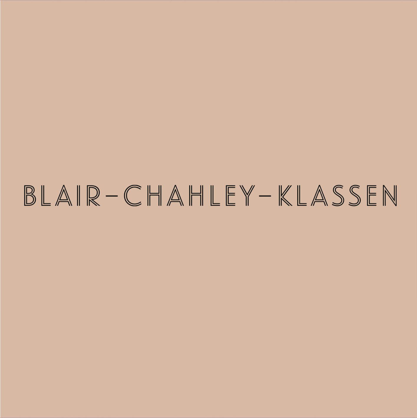
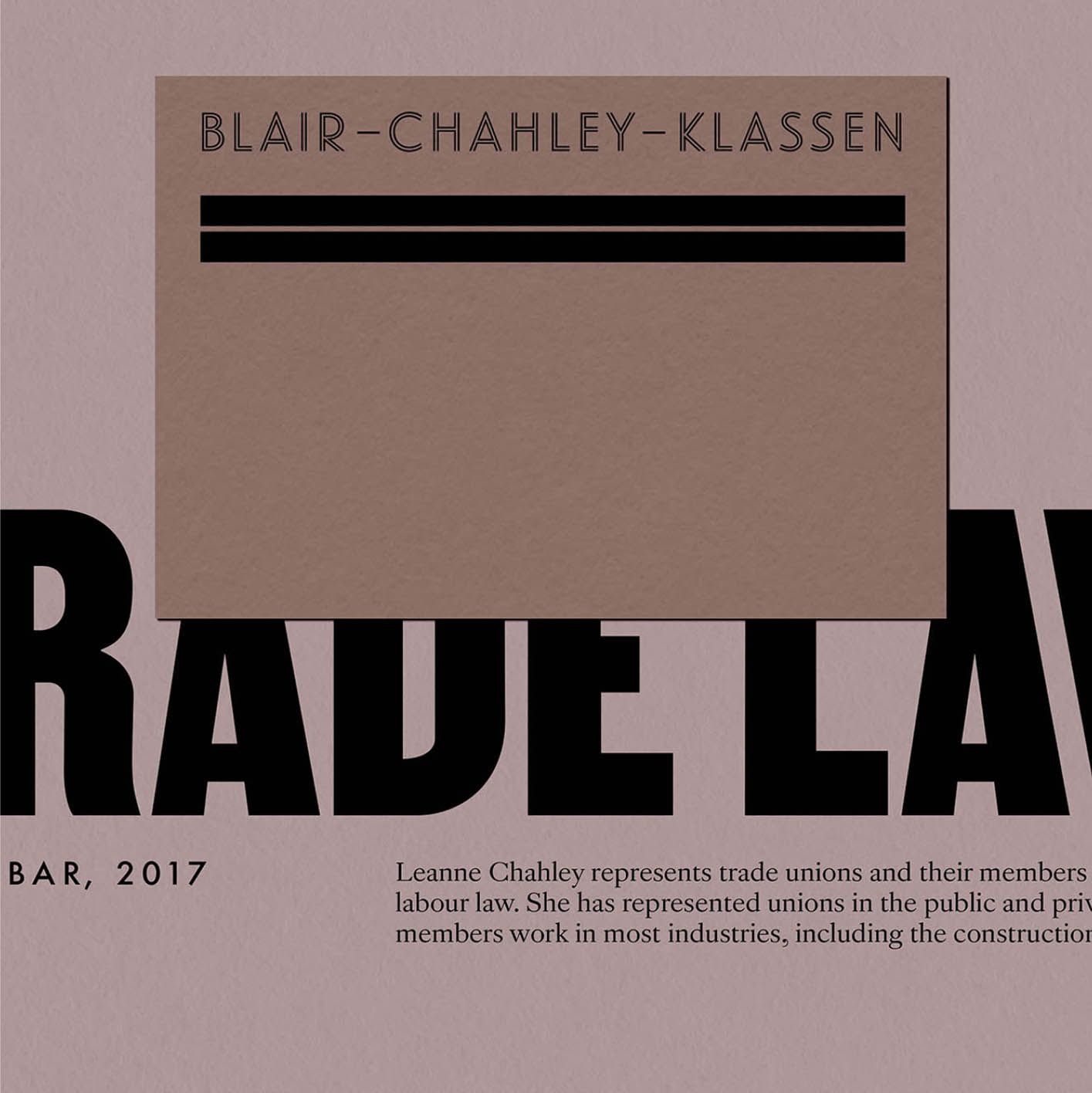
Blair — Chahley — Klassen
- Leigh Wells
At the elite level of legal practice, it’s not your logo that gets you noticed. Superior Court Judges aren't exactly swayed by elegant typography. When you almost exclusively focus on representing unions in labor disputes in the Supreme Court of Canada, it’s your reputation, relationships, and past results that draw business, not your back-of-bus display ad. But as the partners at Blair-Chahley-Klassen knew, it still pays to set yourself apart with a brand that signals something deeper.
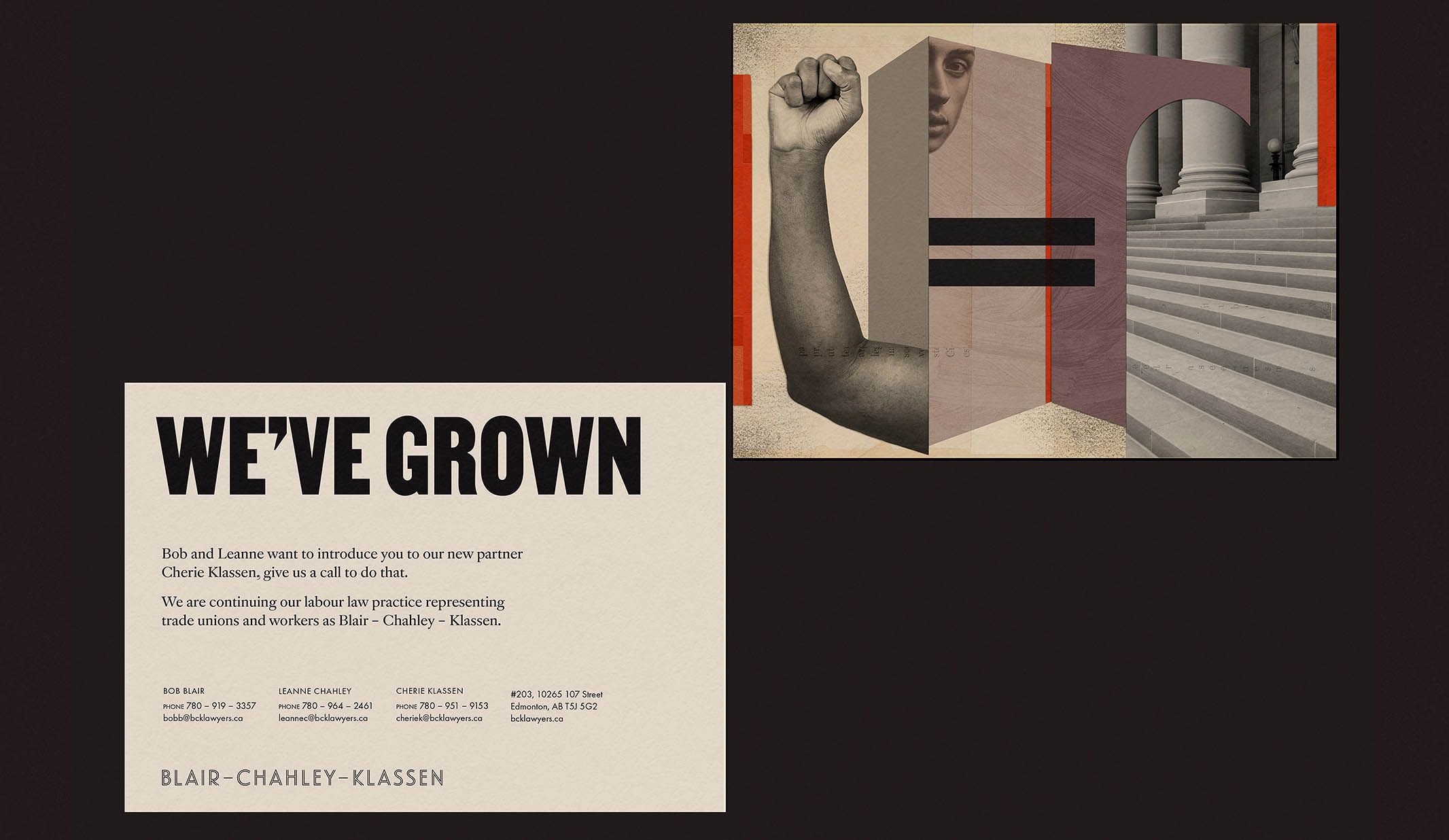
With a new partner arriving into the firm, they asked Otherness to build a brand that would welcome them and create space for their own legal interests. The brand would signal progression, evolution, and pride in being different — the firm, as they describe themselves, are innovative black sheep, known for taking progressive interpretations of the law to the highest level and winning.
The resulting brand is a journey through the history of activist law, bound together with a classical logotype that serves as a foundation in equality. It blends sophistication of thinking with a deep empathy for the working person. And as the new partner looked to take their work into the area of human rights, it honors the conceptual progression beyond fighting for specific rights to the intricately bound fight for all rights.
From Bob Blair
“Why would you take the most conservative opinion when you’re trying to get something done?”
Consistent in the moment, and consistent over time.
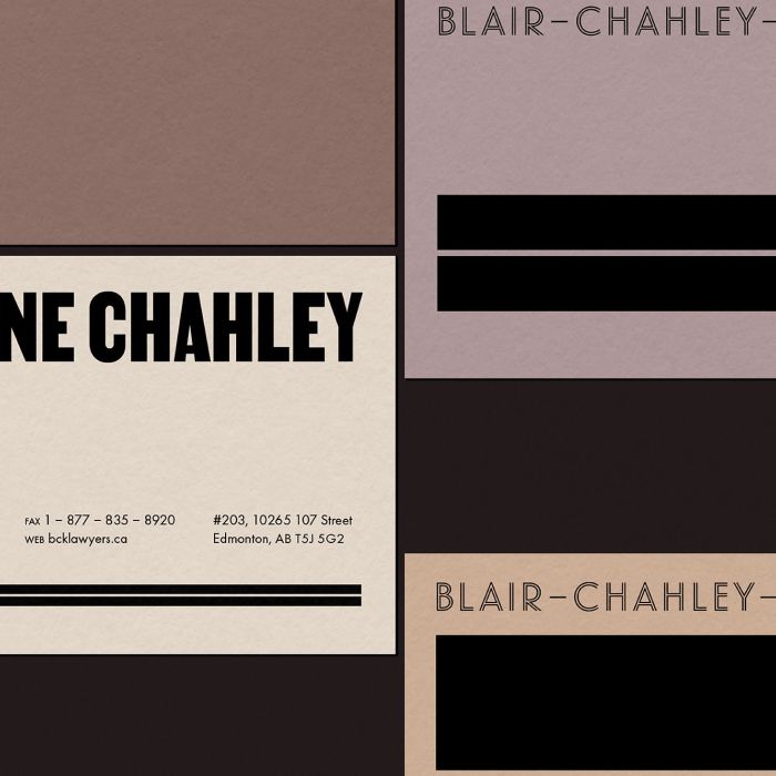
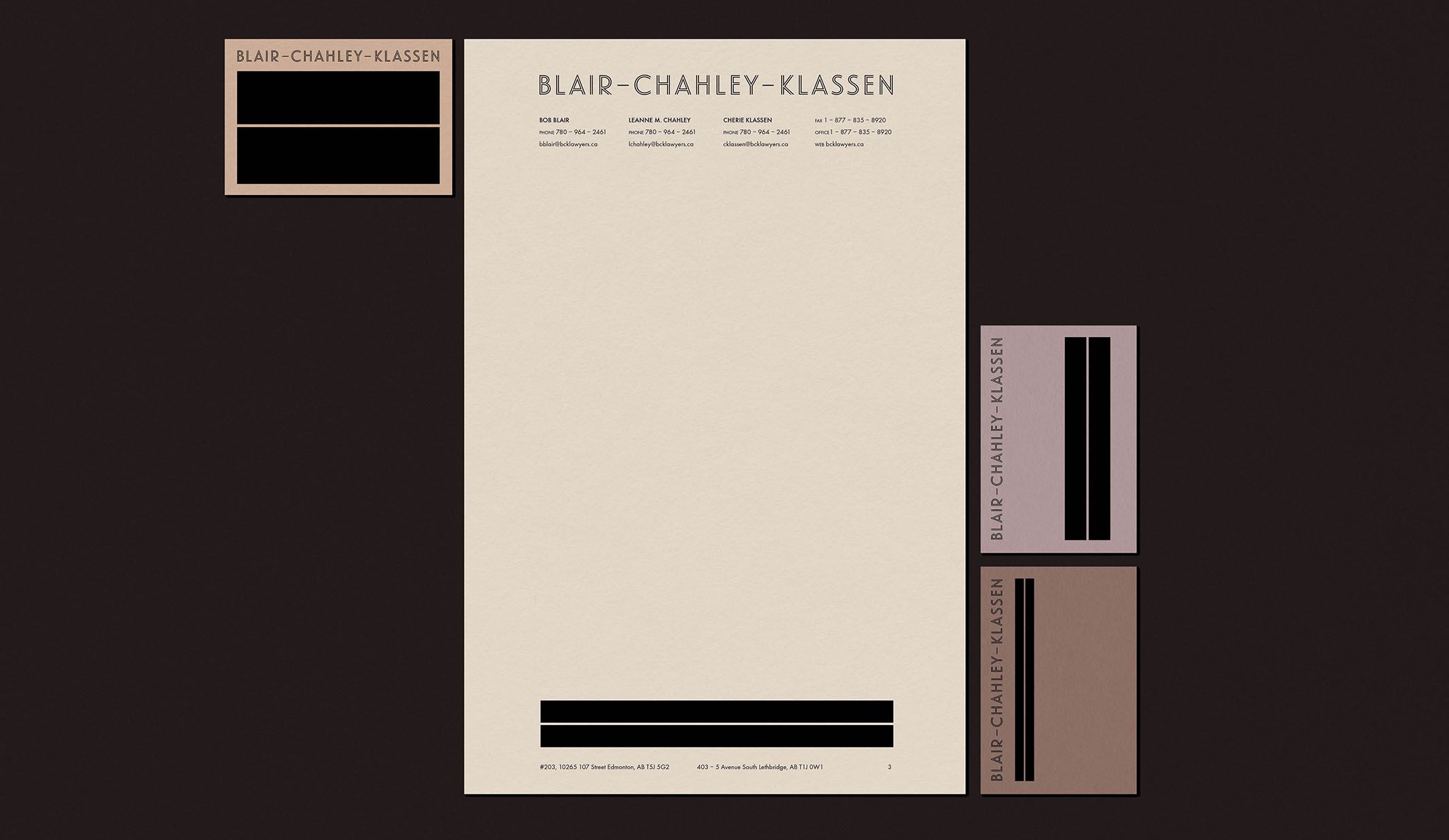
Even as rule breakers, the firm prides itself on specificity of execution. For stationery and and court submissions, we selected the most color consistent and reliable papers from GF Smith — dependable for two centuries — and build the color palette upwards from the soft brown base tones of the paper.
The foundation of the visual brand is in the clean and flexible geometry of an equal sign, combined with the early 20th-century elegance of Hoefler and Frere Jones's Landmark typeface and complemented by the classical pursuit of perfection that is Futura. Between the paper and the type, there’s a timeless respectability that feels inviting, not stuffy.
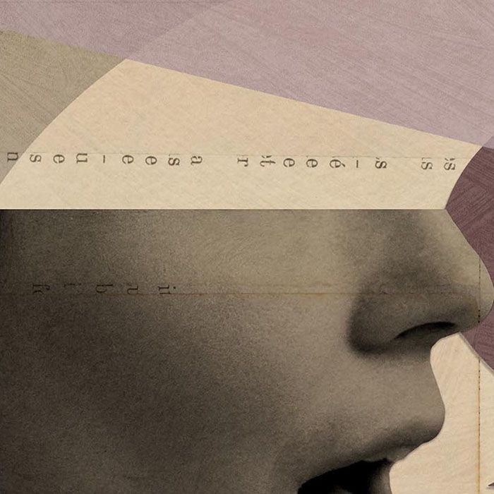
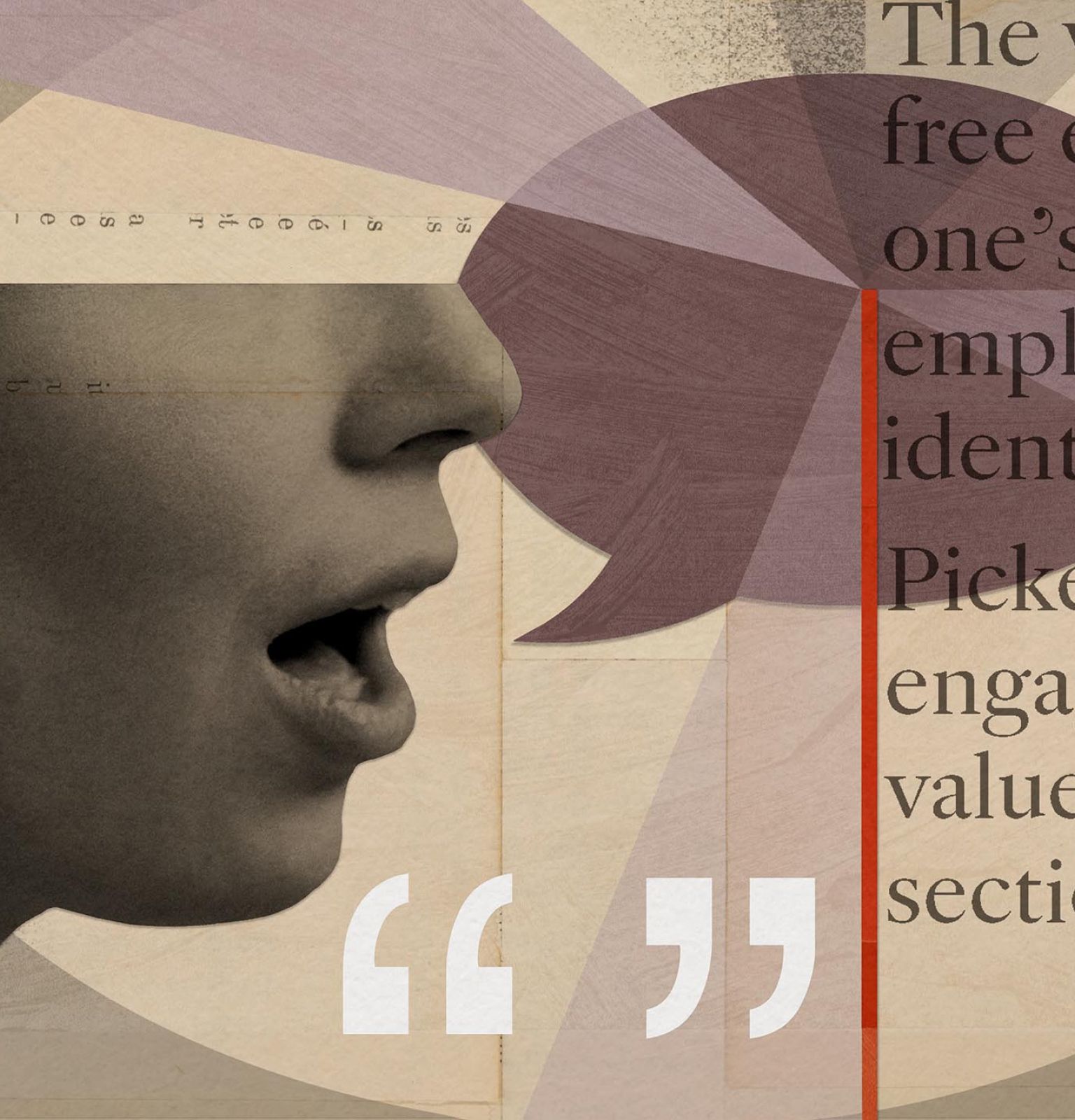
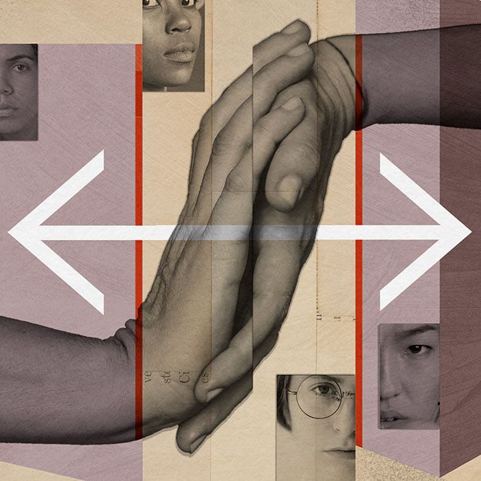
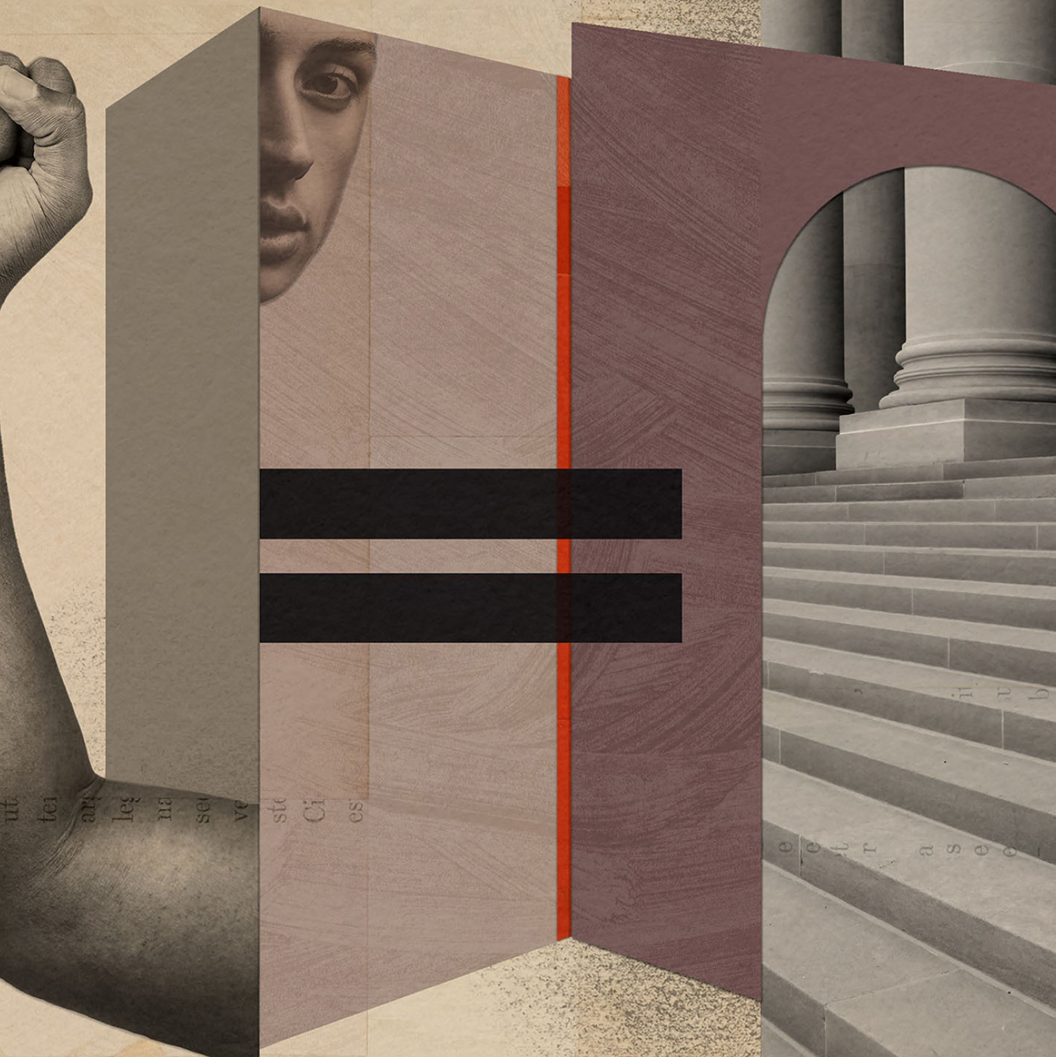
A movement collaged on its history.
As a firm with a deep history in Canadian labor rights, B-C-K knew that it’s not one single moment or act of resistance that defines the success of a movement — progress is a series of fights and shattering changes building on top of each other in that long arc towards justice.
We eschewed classical legal stock imagery, moving instead into the art of collage to visually represent the core aspects of what the firm fights for every day: equality, negotiation, and free speech.
“We loved working with Joel, who took our ideas, talked with our clients, and turned them into a brand that we loved. We recommend him without reservation.”
Leanne Chahley, partner