What do they mean when they tell you, “simplicity”?
Is monolithic simplicity fit for purpose in a modern era? With all our fractured mediums, multiple screens, and liquid timezones? Is it fit for purpose for the new Nikes and Apples of today, operating in their garages, and looking at the horizon?
The painter sweeps their brush across the canvas, colors following the contours and bumps of the layers underneath, a thick layer of titanium white covering the geographies of colors that set before it, thick application after thick application, covering the riots of color underneath.
Simplicity as an ethos started as a manufacturing shift coming out of the necessities of the industrial revolution. It found its footing on the cusp of World War II by the Bauhaus.
Today it often acts as a philosophical bludgeon for designers: grid systems, simplicity, pixel perfect, less is more. Maybe you’ve heard your designer tell you these things. Maybe you are left with two fonts and three colors, and a few Linkedin memes about how “a logo isn’t branding” and no real clue where to go next.
As brands scale from small affairs keeping the lights on, to leaders and lighthouses guiding the way, the opportunities to understand customers and speak to them grow exponentially. Your personas become real people who may not agree with the trajectories you’ve set for them. The markets start to push on you, co-opt you, copy you, steal from you — and in turn you navigate the twists and turns of being a business in the real world, seeking to be seen and selected.
So where do three colors, two free fonts, and a logo fit?
Is monolithic simplicity fit for purpose in a modern era? With all our fractured media, multiple screens, and liquid timezones? Is it fit for purpose for the next Nikes and Apples, operating in their garages, and aiming towards the horizon?
More importantly, were those brands as “simple” as they ever seemed in our minds' eyes? Are the brands that stand out to us truly as simple as they appear? Or instead, did they aggressively grasp the contemporary, falling in love with their time and place, and use the energy of the moment to reveal a facet of themselves?
Do you need a logo on a grid that you’ll never use (or, really, understand), or do you need clarity into how you should navigate the atmosphere of the marketplace today and tomorrow without losing your brand’s soul?
When designers bang on about simplicity, what you should demand, instead, is clarity.
Being on the edge means being misunderstood.
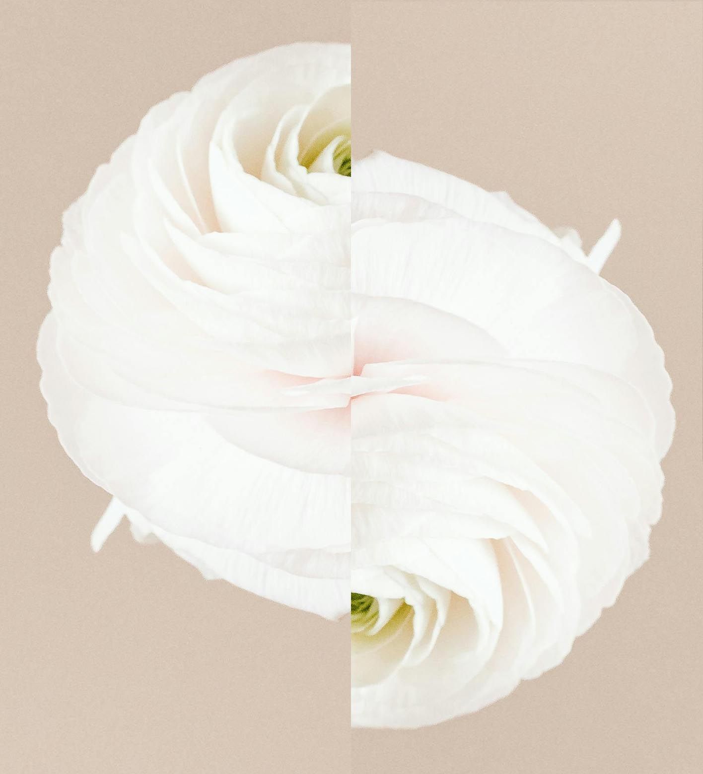
In late 2022, the life sciences startup Medable found themselves in a similar conflicting relationship to simplicity. As visionaries in the niche of digital clinical trial platforms, they’d broken through the usual clutter we’d associate with pharma and medical brands. The look was simple: one font, two colors (and a few tints), a grid, and spacious photography of bare shoulders, dapples of freckles, and expressive gesturing fingers, paired with moody shots of microbes from the petri dish.
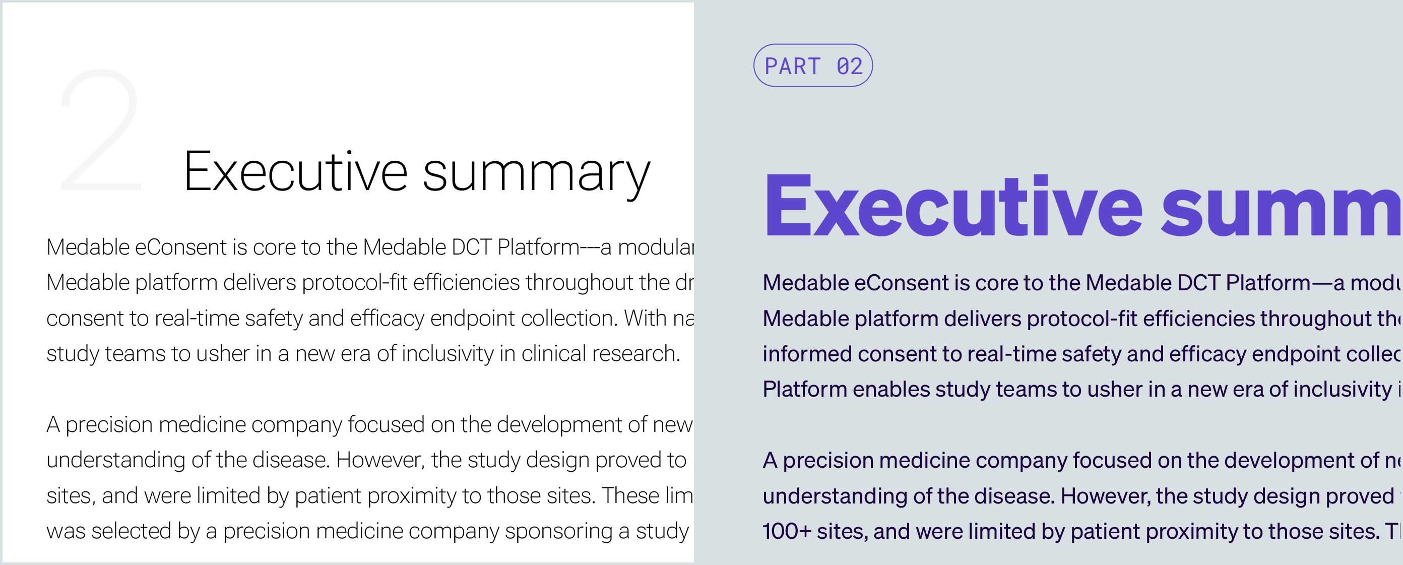
Though minimalist and simple, Medable's typography left them with few options in a world of dense, technical content.
Though incredibly elegant, their brand system was strangling them. Thin fonts that looked gorgeous in highly controlled situations demanded heaps of negative space to be successful. In reality, Medable's biggest tool for assuring credibility were dense technical materials. As a design system, they had grid systems that worked only in a few specific formats, and photography that had the target audience mistake the brand for a skincare company.
Fundamental misunderstanding is an invitation for meditation inwards and projection into the future; coming equipped with new knowledge from the experiences gained (for better or worse). It’s an invitation to ask where the pursuit of simplicity has led to a loss of fidelity. Where might complications bring out truer versions of oneself?
Misunderstanding means returning to the source (and in Medable’s case, the voice of their founder) to anchor the company in where it needs to go, and how it will do that on its own terms.

Medable's previous art direction (left) had customers confused: Were they a digital tool, or a skincare brand?
Strategy that is durable is filled with contradictions: to be impressive but not arrogant, to be an authority who is down to earth. To be credible in a deep technical niche, but also at ease in the company of brands like Sonos, Apple, and Rimowa.
The layers of contradiction become pathways to meaning: to find contrasts and juxtapositions, balancing tensions back and forth across a range of emotions.
Contradictions are keys to context. Contradictions embrace the grey areas between separate perspectives and become a wellspring of ideas that can play off each other. They adapt to context, mood, and trend.
Contradictions give a brand EQ — the ability to read a room — to know when to wear work boots and when to wear a white tie.
Elevated.
A human touch.
Tech forward.
A staid, clinical category.
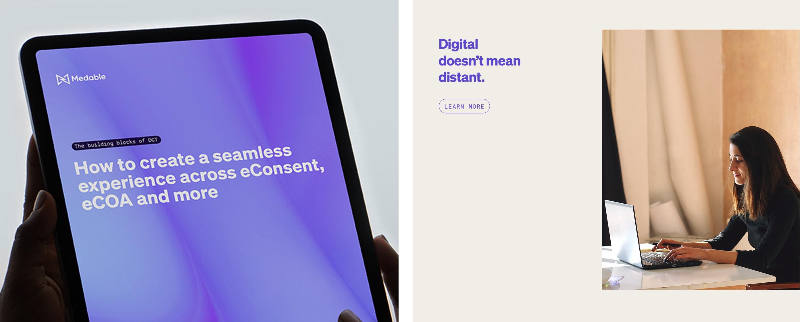
Contradictory yet interoperable: the blend of tech and lifestyle for Medable.
Entanglement & clarity.
A warm, chic camel color, mixed with a digital-only purple.
Combinations that link the sensitivity of a premium fashion brand to the speed and always-on sensibility found on ubiquitous screens.
Everything is more entangled than we usually understand, shifting between the personal, the cultural, the logical, and the institutional.
In embracing emotional contradictions, a brand can continually surprise with its range of expressions.
For Medable, contradiction plays through all of its look, including the subtle world of typography. Here, a robotic DOS-era font signals a sense of precision and technicality that's unconcerned with aesthetics. In counterbalance is a hard working, modern-but-friendly sans serif family, filled with weights and options.
Contemporary yet technical.
Big yet fast.
Elevated yet welcoming.
The elements of type, color, pattern, photography, and animation are layered in turn. Each brush stroke building on another.
What ultimately seems simple is a delicate constellation of meaning, filled with contradictions, moods, and contexts.
Medable's communications now range from technical to human, allowing for tailoring to context, and space to embrace the contradictions in the brand.
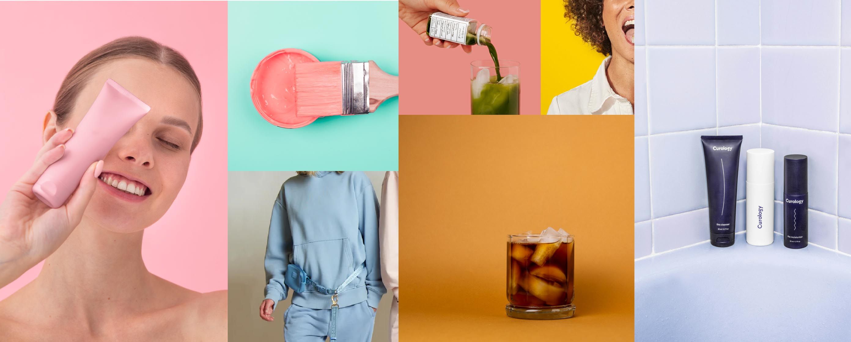
Three colors, two fonts, one logo.
If the world was ever simple, or at least simple enough to merit a monolithic approach to branding — where a few colors, and a regimen of simplicity is enough — it certainly isn’t now.
The economics of venture capital funding have shifted. What was once betting on a return (with 0% interest rates) is now another situation. Brands need clearer reasons to exist in the eyes of customers and their VC backers. And startups need more differentiated, harder to copy branding to keep the market space they want to claim.
It is important to not just point to Pinterest and say, “me too." It's not enough to nod along to the branding memes of simplicity.
Who is that "me", and what does "too" look like? What are you chasing, and why? If you can find it on a Pinterest board, how will you defend your edge in a market swelling with choice?
Like the champions of simplicity of the 1940s and 50s who were eager to leave the messy past of the World Wars behind, simplistic approaches in a complicated world often leave us wanting for something more human, and messy.
Simplicity flattens individuality: Branding (blanding) of the 2010s.
The ironically-iconic blanding look of the mid-2010s (modernist, minimalist, approachable) was just as character-erasing as the rebrands of the 1950s, if not as idealistic.
Are three colors, two fonts, and one logo enough today?
What do we leave behind of our unique perspectives, our visions, and our opportunities to shine when we embrace simplicity without question?
So, when designers bang on about simplicity — instead turn inwards and seek clarity. It’s far more durable.